05 Apr 5 Tips for Refreshing a Brand’s Visual Identity
Does your brand need a refresh? Updating a brand’s identity can be a massive undertaking, however, it is oftentimes necessary to stay competitive. We’ve outlined five tips to consider as you prepare to refresh your brand’s visual identity.
When designing a brand identity, it is important for colors, typography and form to remain consistent in all applications of the brand.
With Apple’s launch of the apple monogram logo, the brand started using the font Myriad Pro consistently in all of their products. This font is the default on computers, and is what’s used in ads and in stores. Apple also strictly keeps to the logo and text only appearing in black and white with color shown in their products and other pieces of visuals that represent what their products do.
2. Something borrowed. Something new.
Whether it’s driven by updated messaging, recent business changes, such as a merger or acquisition, or to improve competitive differentiation, sometimes a brand’s visual identity needs a facelift.
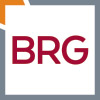
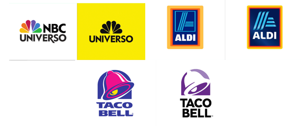
When going through the re-brand process, it is advisable to borrow something from previous brand identities. This can include a monogram or color scheme so as not to lose your loyal audience by creating something too “new.” Here are a few national brands that recently refreshed their logos without changing it too drastically.
3. Designing a brand identity goes beyond just a logo.
What is your brand voice? Is it friendly, formal, tongue-in-cheek, casual? Copywriting is as important as design and sets the tone for your entire brand experience.
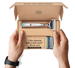
The Dollar Shave Club plays off of their product and their brand differentiator to create a unique tagline, “Shave Time. Shave Money.” They also use humor in their materials to connect with their target audience and effectively represent their brand voice.
4. A brand identity does not change as frequently as a tagline does.
It takes a great deal of time (and money) to change your brand’s visual identity. In lieu of a full brand facelift, consider changing the tagline to diversify your brand. This can offer the opportunity to relate to a new, expanded audience.
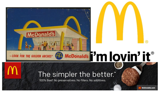
McDonald’s has evolved their tagline a few times in the last several decades to stay competitive. In the 1950s, they used the tagline, “Look for the Golden Arches.” Since then they are known for the long lasting “I’m lovin’ it,” tagline, which turned into a popular jingle used in their advertisements. Most recently, the tagline, “The Simpler the Better,” helps McDonald’s relate to a more health-conscious audience.
5. Differentiation is key.
How are you similar and different from your competitors? Try to avoid being too similar to what others in the same industry are doing. Closely analyze competitors and what makes your brand unique.
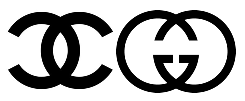
A perfect example are two companies in the fashion industry. Chanel and Gucci both have long-standing loyal audiences, but there isn’t much setting them apart from each when it comes to their logos. Think about your direct competitors and make sure you visually differentiate yourself from the crowd.